Some of our latest projects

By December 30, 2021 August 25th, 2023 Logos

November is considered by many to be a busy month. The projects released by our partners in November are precise proof of that. We would like to share the brands that are already in the market and Indigo Branding Agency has made a great contribution in creating and developing these projects. In our journey result is the most important factor that makes us continue our work in the best way.

Katna
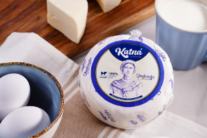
 

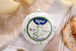
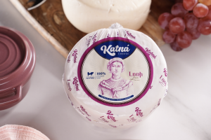
We started this project from naming, branding, and continued it to digital marketing. After a year of work, the “Katna” brand was launched, which has already become a favorite product for loads of people.
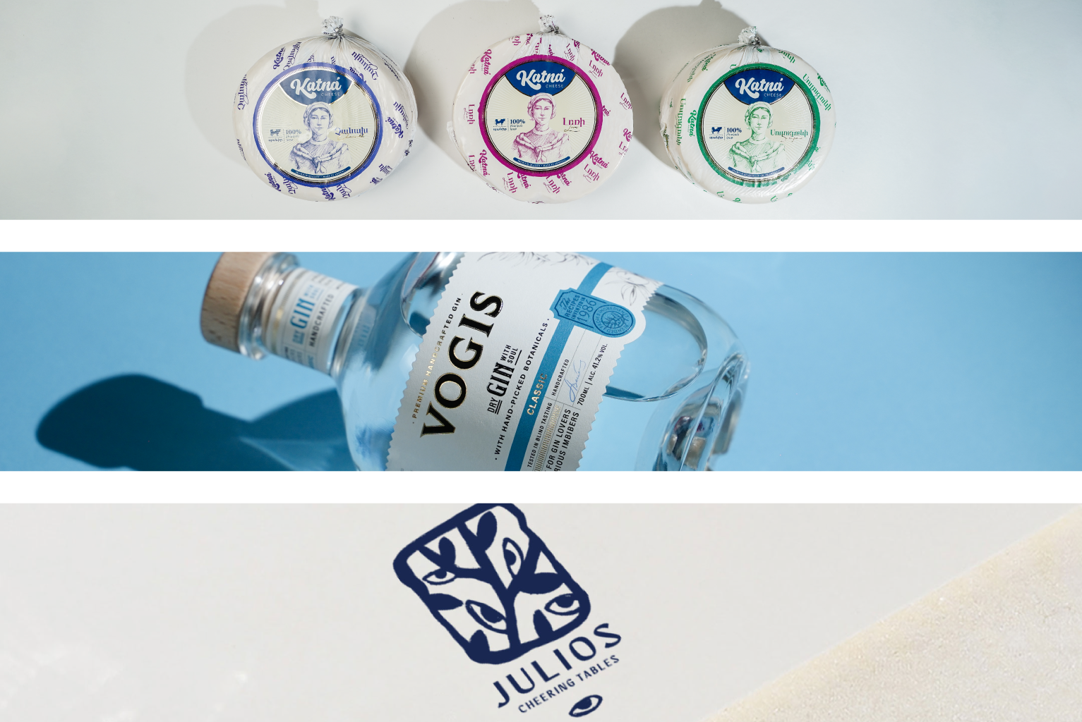
The fact that Katna was made exclusively from natural milk has become the basis of branding. In the wide range of dairy products offered to consumers today, it is difficult to believe that the product is made of natural milk, so the name itself should emphasize that the new product of Galaxy Group is made of 100% natural milk. The name “Katna” was chosen as the conceptual basis of the project suggests that dairy products are natural. Later, storytelling was formed around this name ․ Katna is a city that has to supply the world with  natural milk, and Nare who is responsible for all this continues the work of his ancestors. The image of Nare became key for the packaging design. Since the cheeses on the market had mainly red-yellow packaging, they did not differ in anything except the color layer, in the case of Katna, we chose blue, green-red-saturated shades to respectively represent the Chanakh, Suluguni, and Lori cheeses which will allow them to stand out on the shelves.
We kindly undertook the implementation of an advertising campaign based on love that is to enter the market in the form of a new brand. Perceptions of love are different: love for family, relatives, homeland, or profession. It is love that inspires us to achieve our goals and to overcome the most difficult obstacles in life. Since 2020, “Galaxy” companies, especially MegaFood have worked to create love, warmth, and dairy products available to all families. Today, Katna enters the Armenian cheese market. 

Vogis


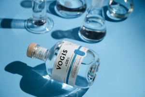
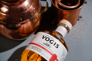
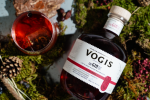
Vogis is an Armenian gin, which is made exclusively from juniper growing in the Armenian highlands. The gin was called “Vogis” for it is made with devotion, valuing the spirit of the ancestors. The story of the product played a huge role in branding. In 1980-1986 the business trip to Cuba passed through London. It was when scientist Vardan Yavruyan tried gin in the capital city of England, and overly liked it. After returning to Armenia he received the recipe for the drink, using juniper fruits growing exclusively in the Armenian highlands. A few years later, the young members of the Yavruyan dynasty found the recipe of the gin in scientific documents and decided to give new life to their grandfather’s recipes, taking the initiative of making alcoholic beverages with a new spirit. With the same dedication, our designers perfectly fulfilled their task and created the brand packaging. In the past, gin was sold in pharmacies as a medicinal tincture. Therefore, during the creation of the packaging design, a bottle label was chosen, which to some extent conveys the impression of a healing substance, but due to its modern approach and the illustrations of juniper, it has a beautiful appearance. Our marketing team continued this mission again with love and devotion by creating and  developing a digital strategy to promote the brand on digital platforms.

Julios


Experience the charm of Mykonian culture in heart of Yerevan.
Julius Restaurant is a new and mysterious place near the city center, that brings Mykonos life to Yerevan. The restaurant is the embodiment of Greek and Mediterranean culture and creates a pleasant atmosphere with a mysterious mood.
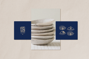
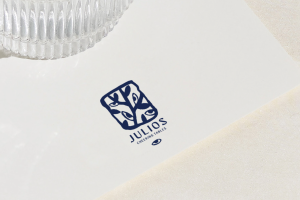
Our main goal was to represent this concept with the design. How we did it? Of course, every single successful branding is a result of diligent work. We started with the research of Greek culture, patterns, symbols, and their meanings. Having summed up the results, we came up with the bizarre and mystifying ideas. The olive and the eye, that is said to have protecting power became the fundamental part of the branding. These symbols express the mystery and magnificence of Mykonos culture.