YAO Branding & Packaging Design
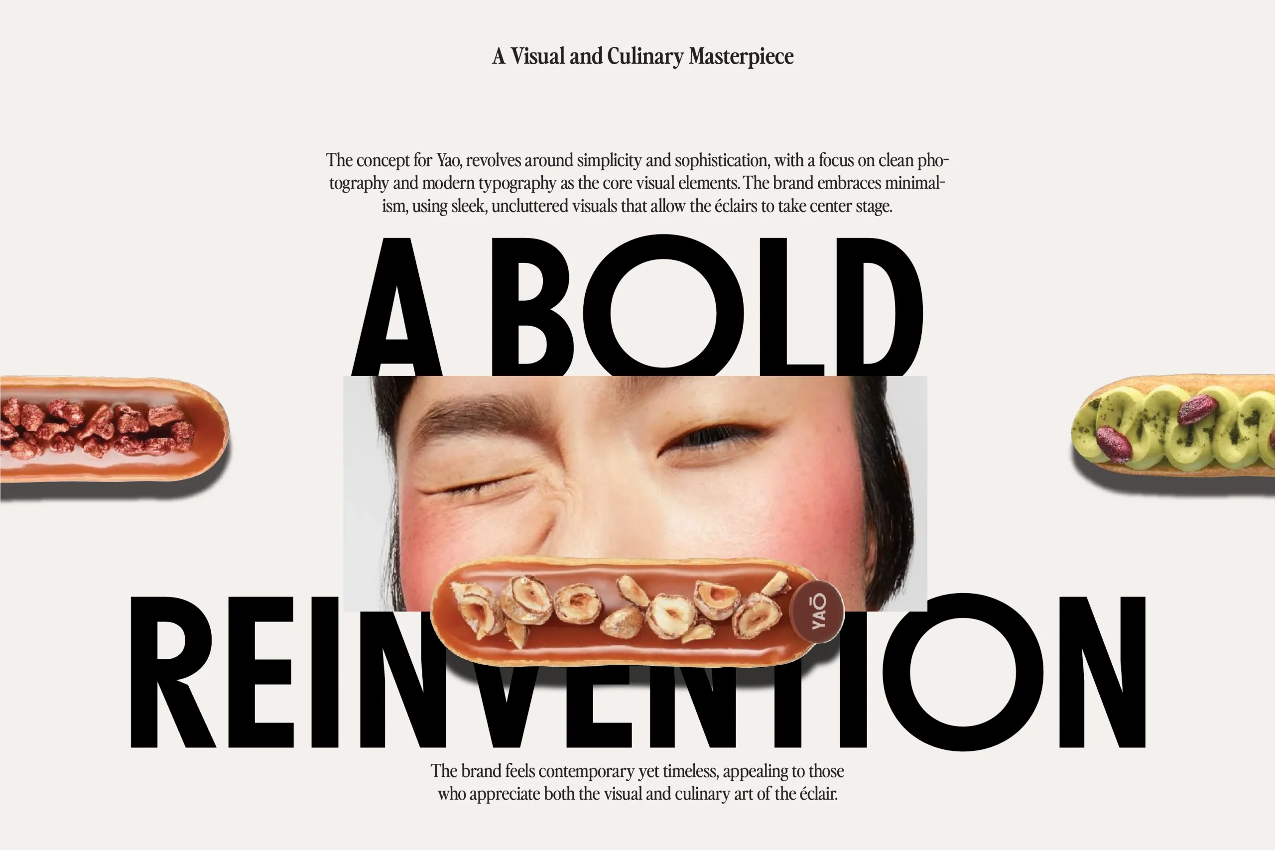
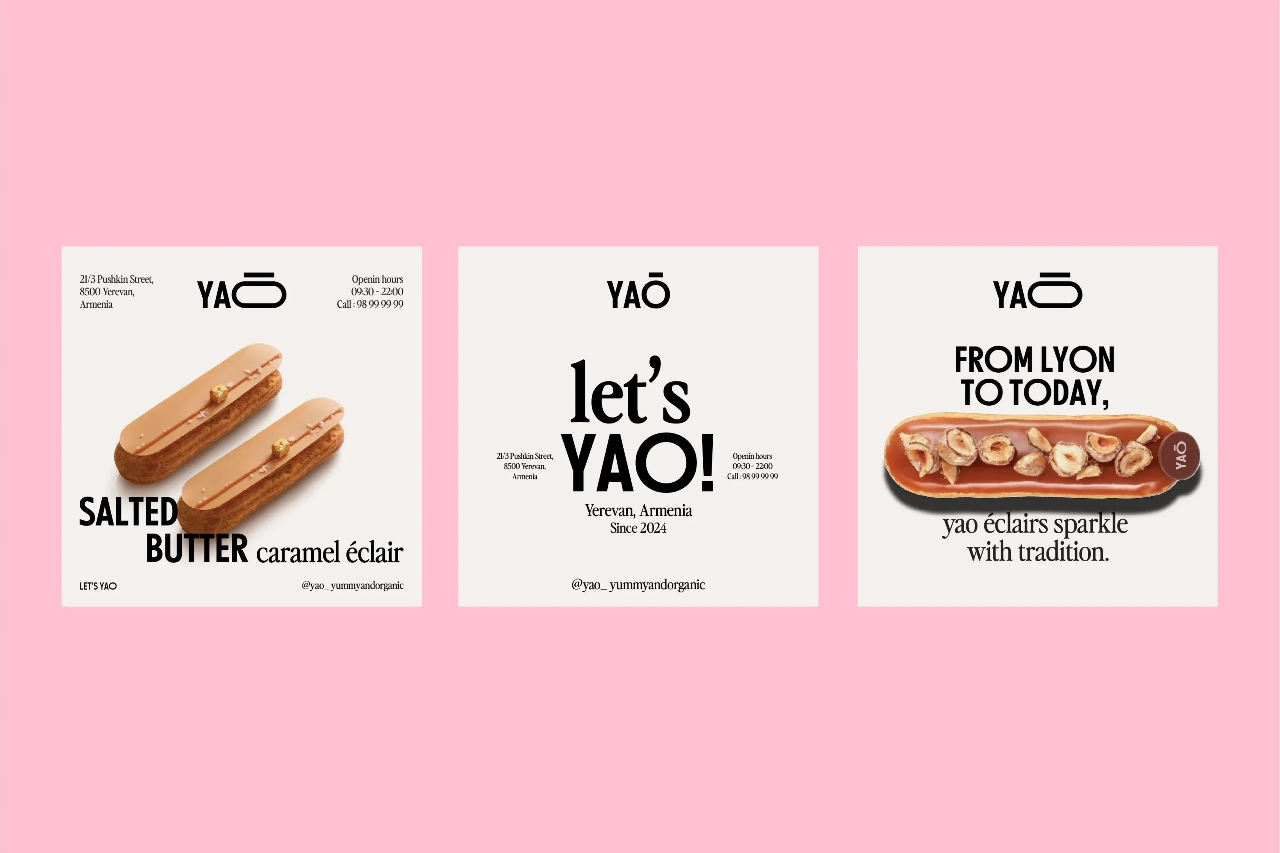
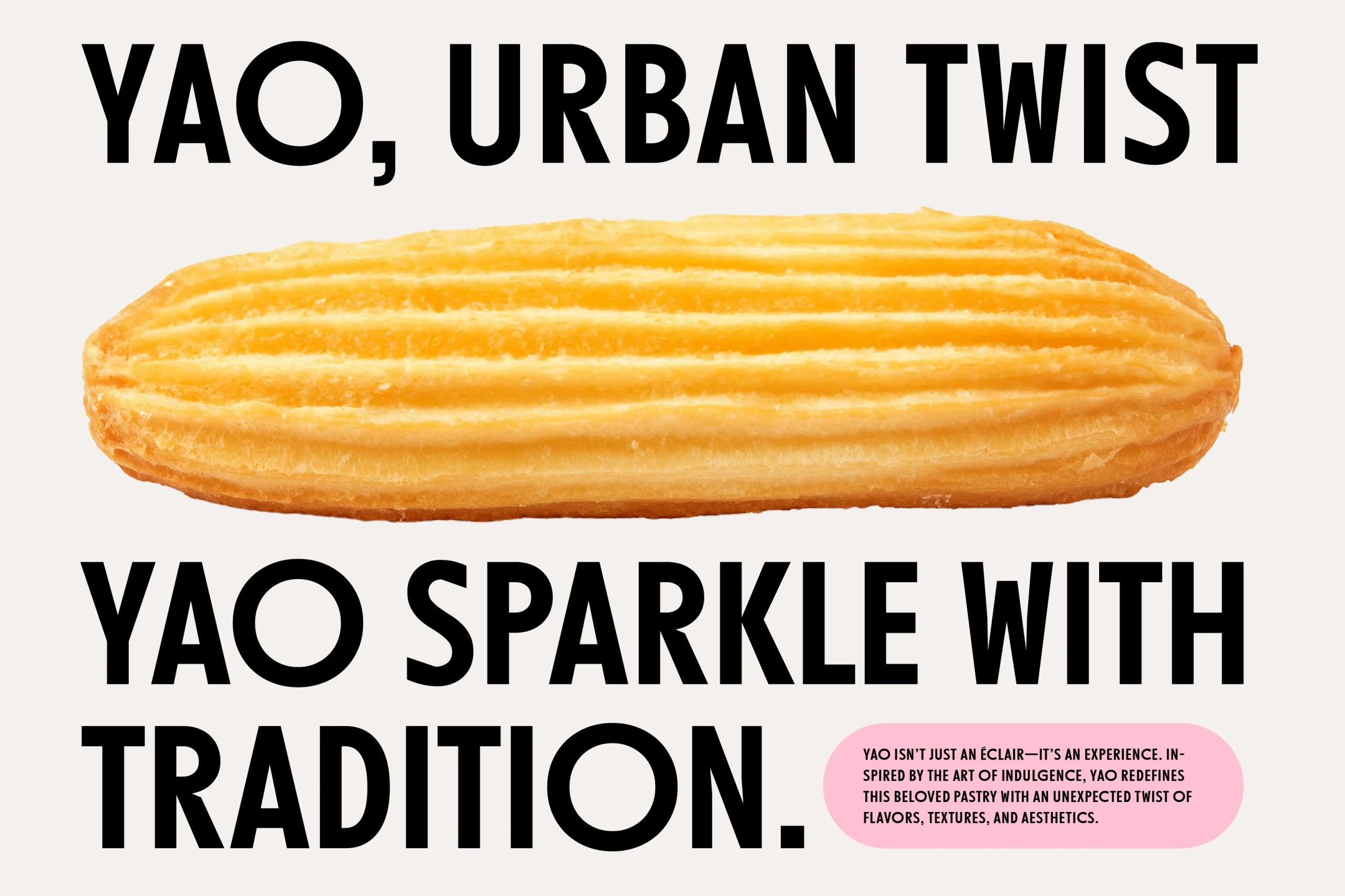
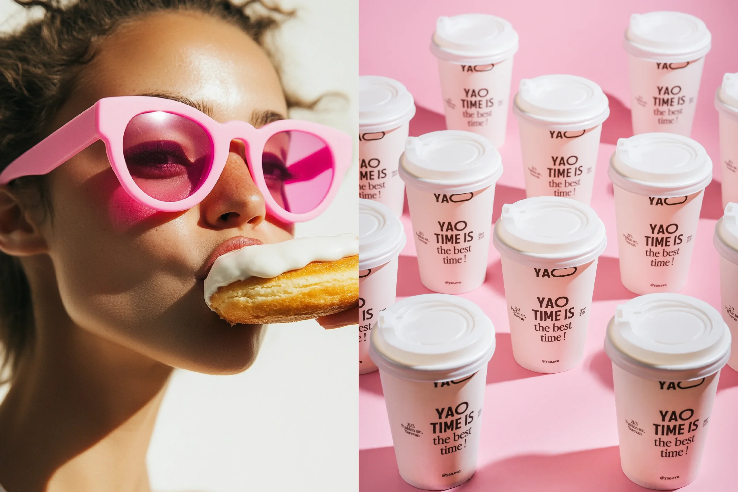
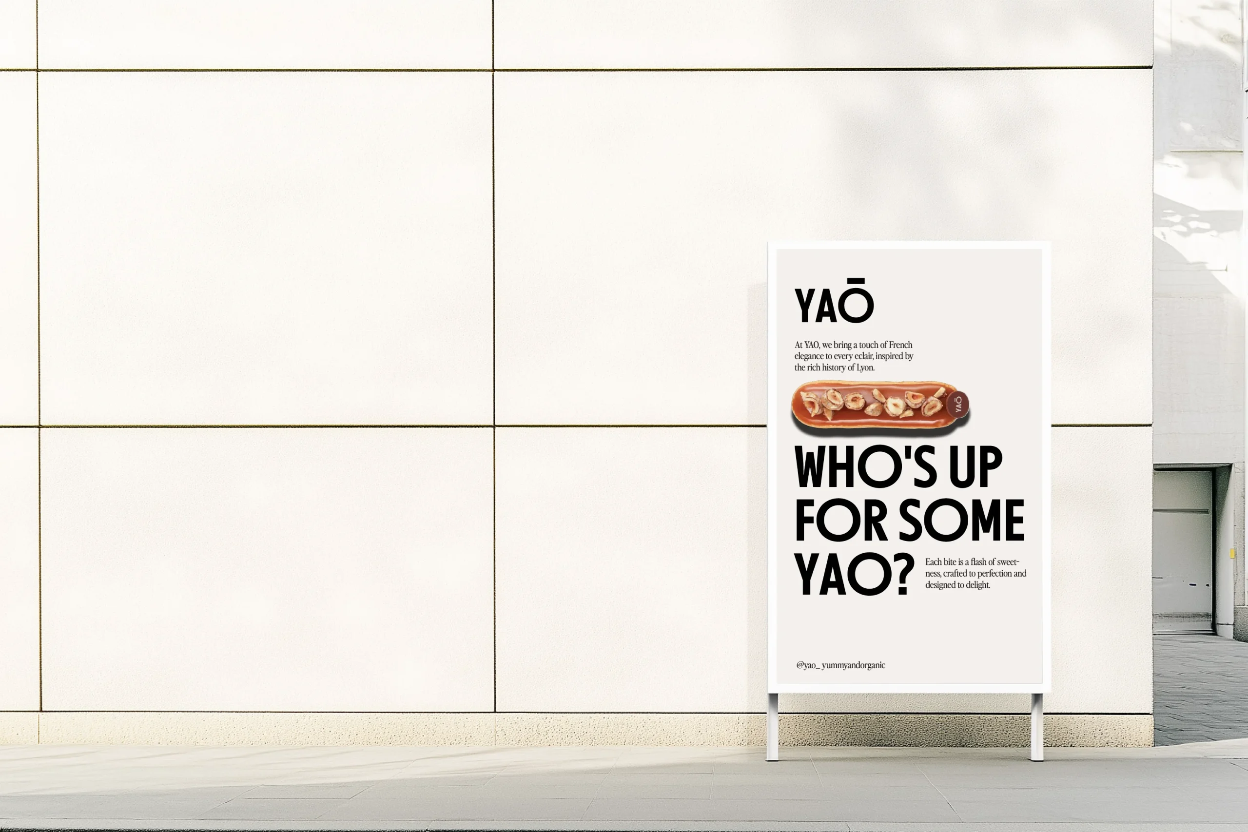
Yao redefines the classic éclair experience with a fresh, urban twist. Inspired by the name itself—Yummy and Organic—we crafted a branding identity that feels minimalistic yet bold, appealing to young city lovers who appreciate both aesthetics and taste.
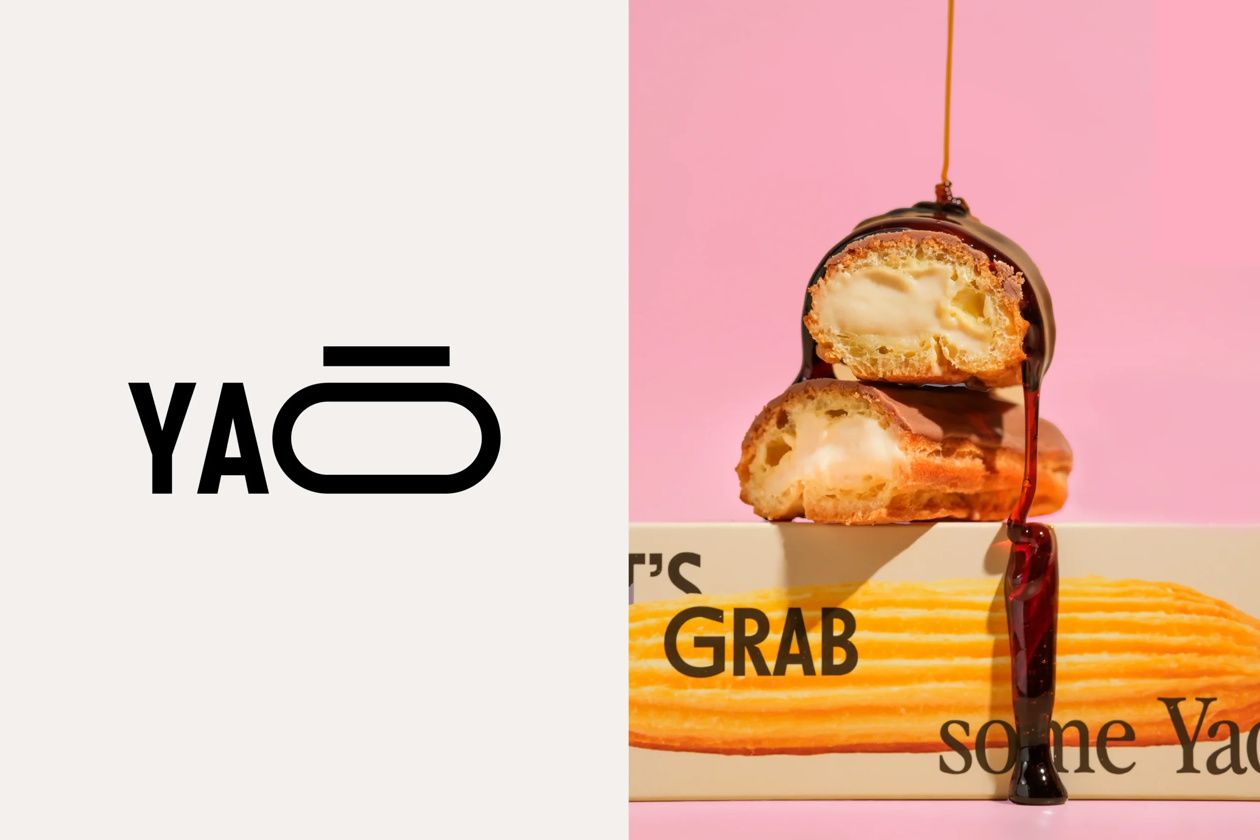
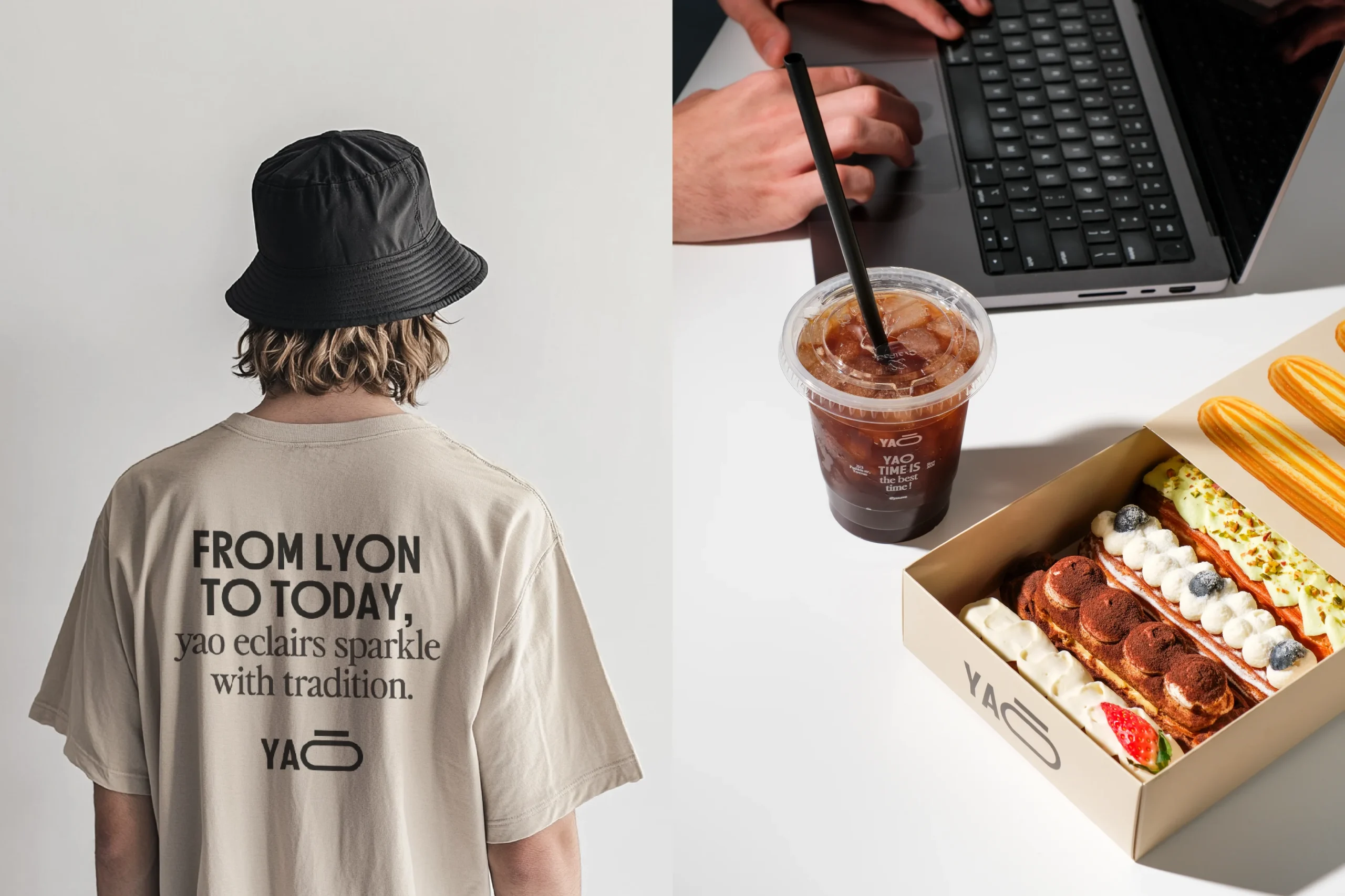
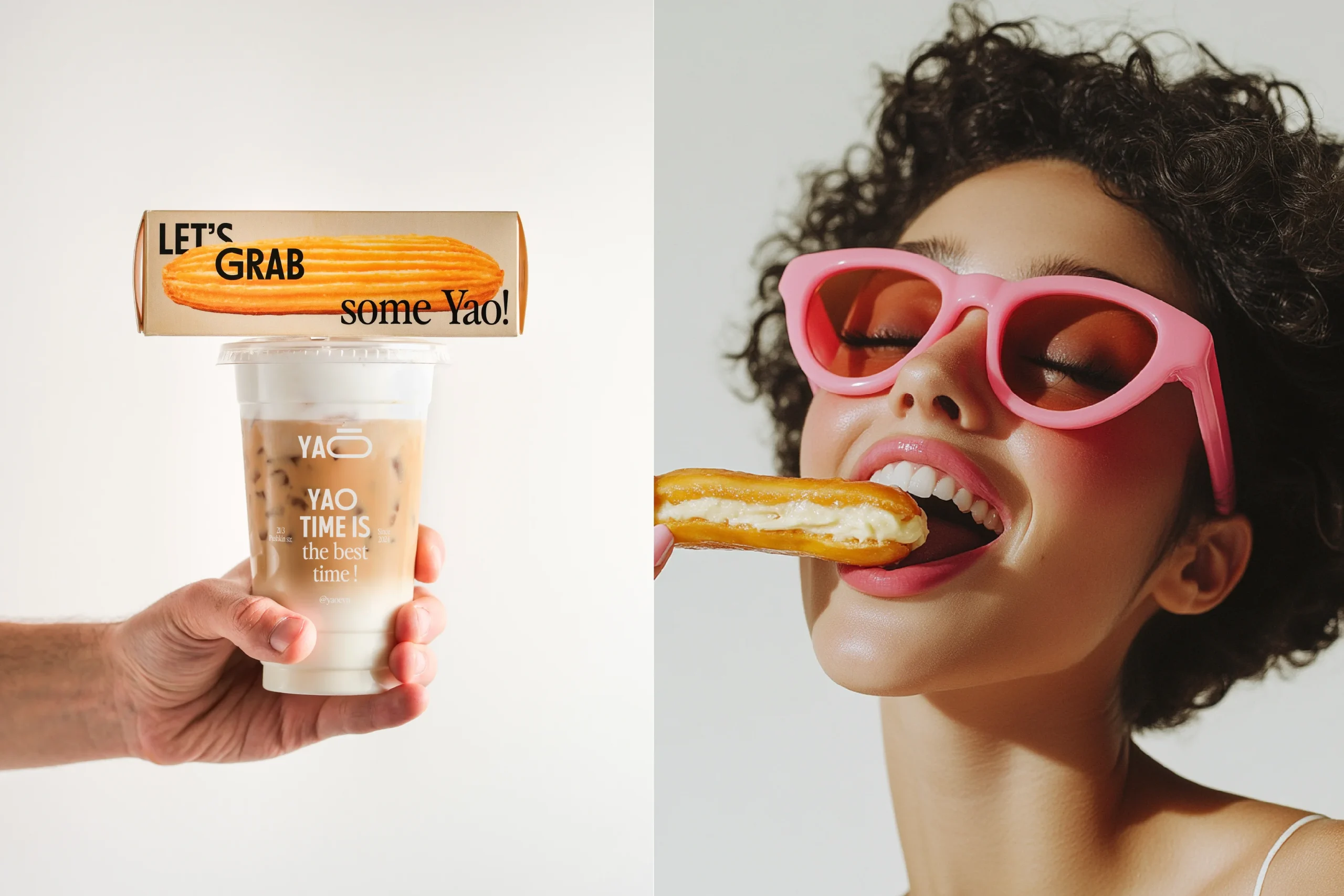
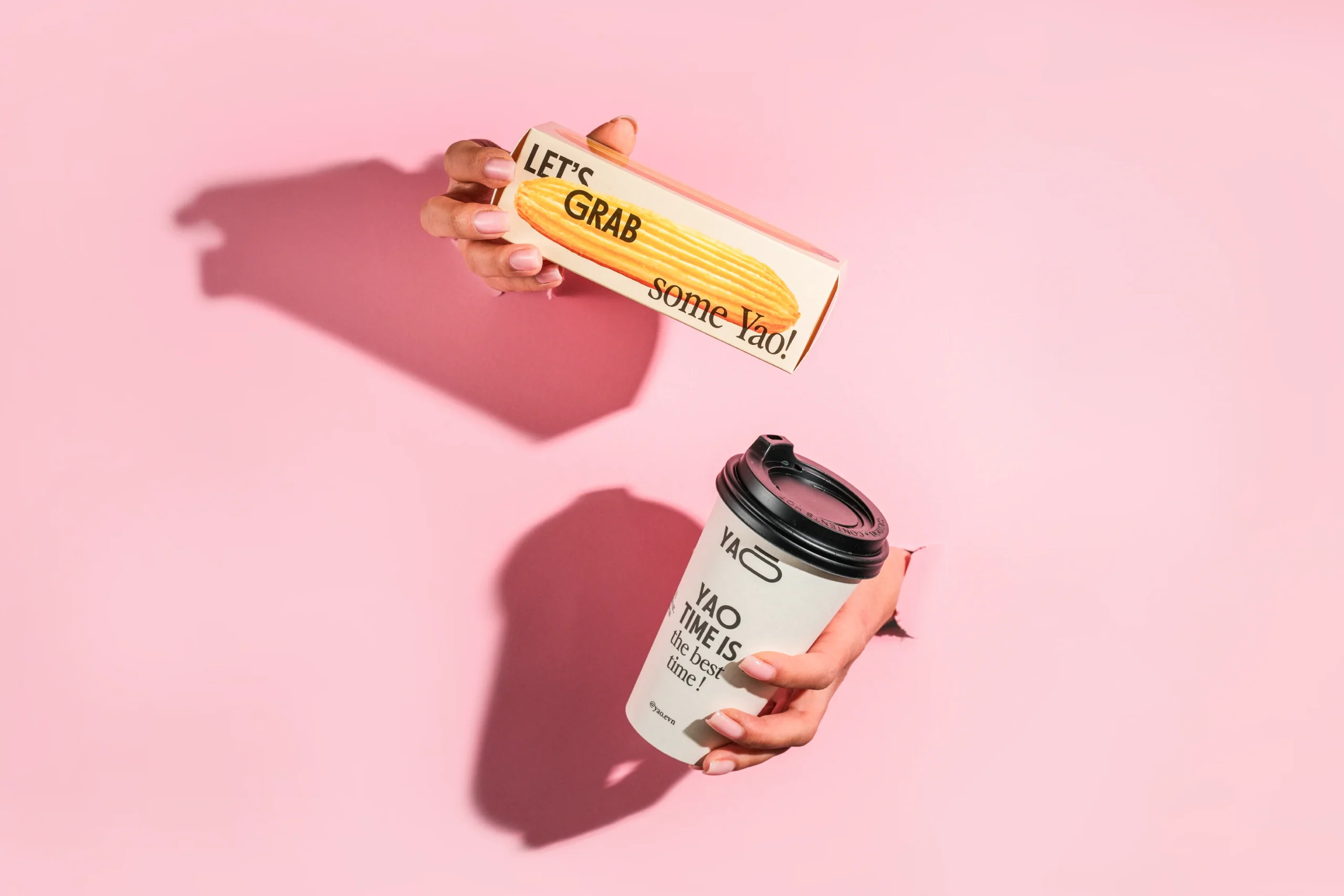
The color palette merges the warmth of beige, reminiscent of golden-baked dough, with a touch of pink, evoking freshness and playful toppings. A variety of dynamic layout options ensure versatility, while our custom packaging design stands out with bold typography and unique éclair-shaped cutouts—a true visual and tactile delight.
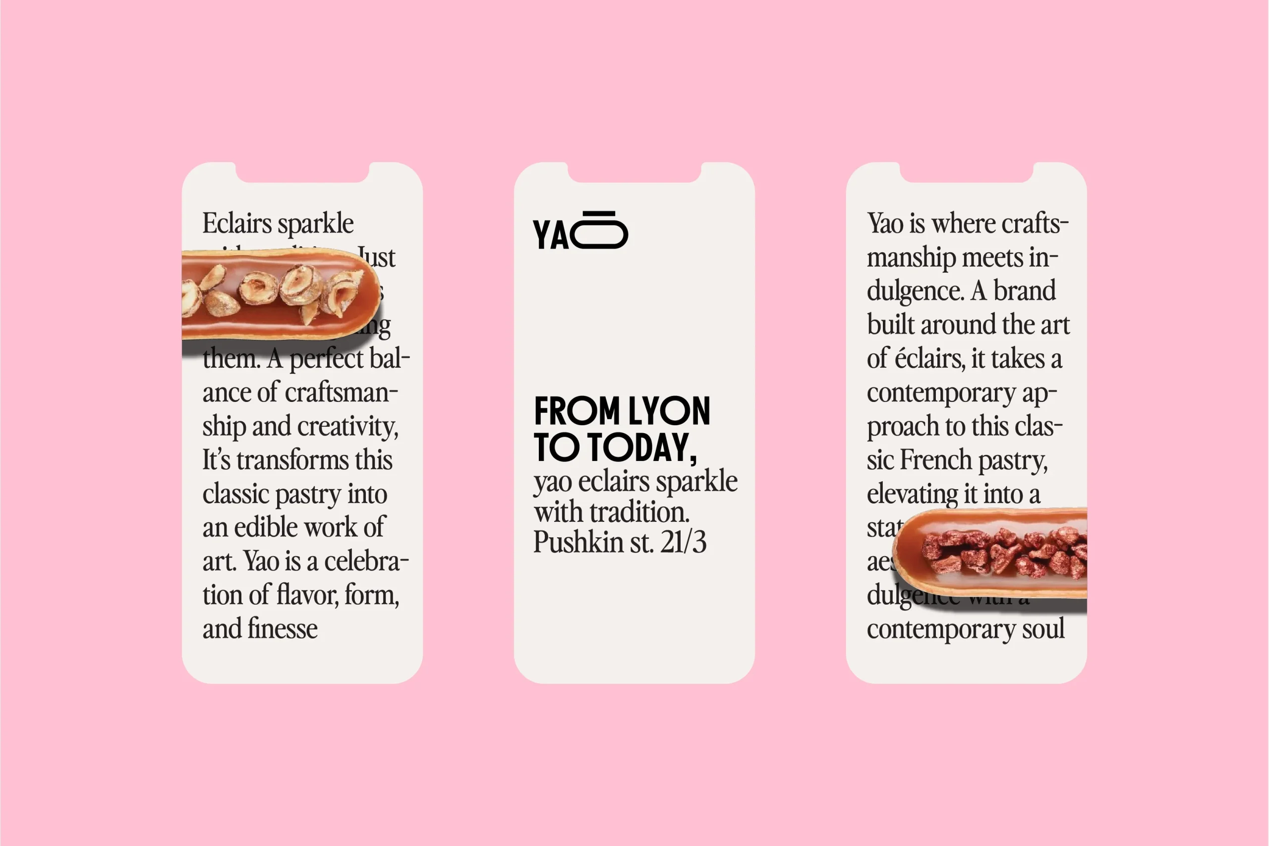
Every detail of Yao’s brand identity is designed to reflect the artistry and indulgence of their handcrafted éclairs. The result? A modern, irresistible visual language that makes every bite even more delightful.