Renault Group is a large French automaker headquartered in Boulogne-Billancourt, near Paris. The company was founded by three brothers: Louis, Marcel O Fernand Renoir. It was originally called Renault-Frères.
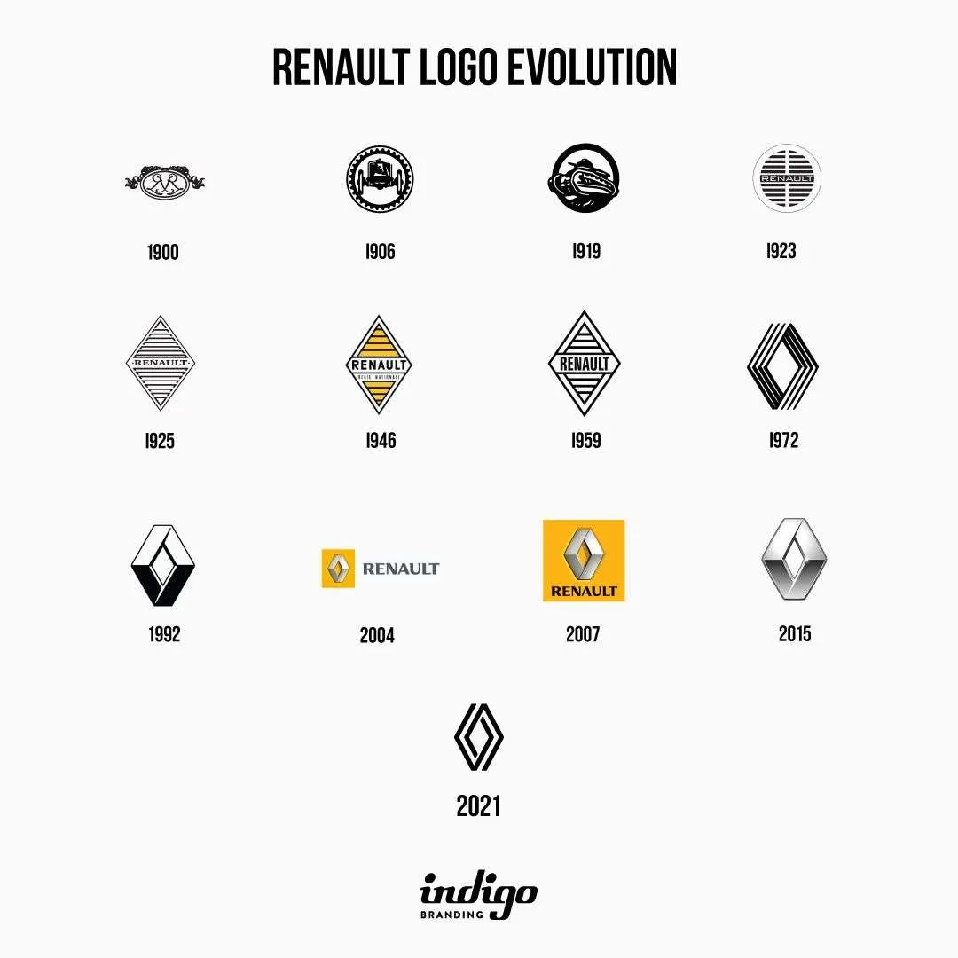
The first company logo was introduced in 1900. These were the capital letters of the names of the founding brothers of Louis, Marcel O Fernand Renoir. However, this logo was used only in documents, and on cars, it was simply written “Renault-Frères” or LR (Louis Renault).
In 1906, the Renault logo was changed. The frame captures the Renault car that won the first French Grand Prix. After the end of the First World War, Renault depicted the FT-117 tank with its logo.
In 1923, Renault put its logo on a car for the first time. The logo had a signal horn that divided Renault horizontally.
In 1925, the famous Renault diamond was born. All logos from this period, regardless of changes, were in the form of a diamond. In 1946, the Renault logo was first drawn. From that moment on, yellow, along with diamonds, became the symbol of Renault.
In the 1970s, the development of the new Renault logo was entrusted to Victor Vasarely. The Vasarely diamond became more expressive, with sharper lines, which emphasized the power of the diamond. Later, the diamond was split into horizontal lines. All subsequent changes retained the appearance of the Visareli diamond.
Reno recently unveiled his new logo, announcing that by 2024 ․ All cars of the company will have a new logo.

