
“Netflix’s only competitor is sleep.” This is how the founder of the company answers the question about competitors. Unsurprisingly, a company with this reaction is one of the most successful in the world, if not the leading one.
Now a little about the company logo.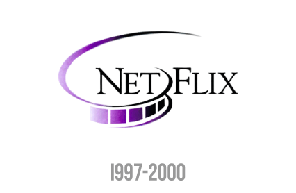
The original Netflix logo was purple to symbolize the company’s originality, and in addition to the “Netflix” text, there was also a film tape.
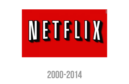
At the beginning of the century, the name of the company was written in white letters and black outlines on a red background, and after a while it changed into the red letters on a white background. Here, the rectangular shape was about letters spoke of safety and reliability. This showed the audience that they can rest easy as they are protected when using Netflix.
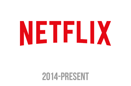
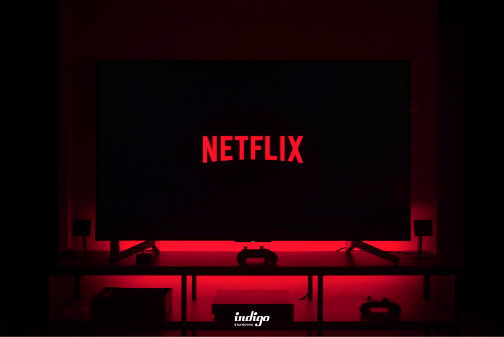
After the popularization of smartphones, it became necessary to reduce the logo and adapt it to phones. Then the logo takes on its final look. Here, red represents the energy, love, and fun that Netflix brings.
