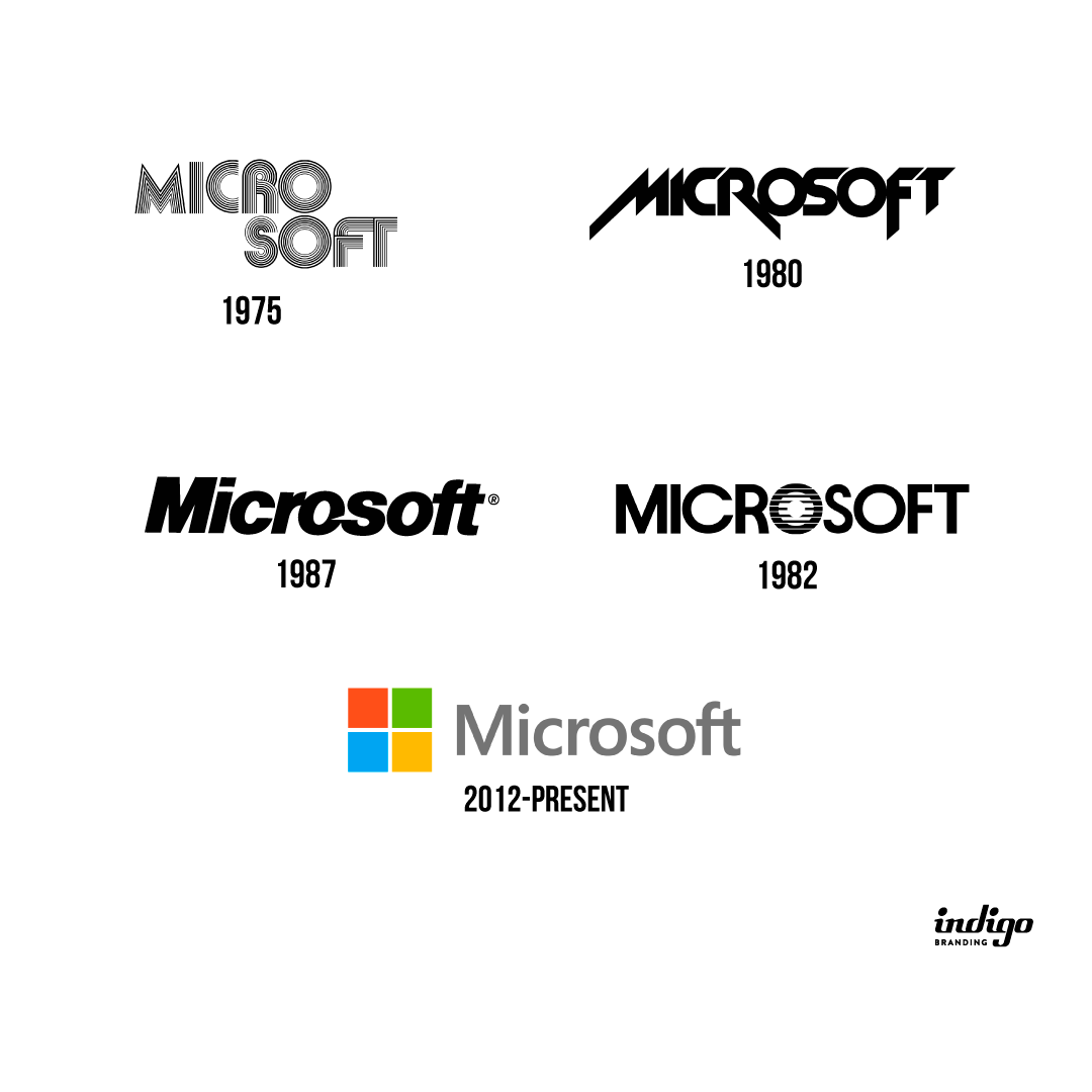
The first Microsoft logo was in the real disco style of the ’70s and ’80s.
In the early 1980s, the logo got the aggressive and sharp edges typical of the period. This one is reminiscent of heavy metal style.
The following logos were more or less close to today’s famous logo. They were more balanced and far from musical styles.
In the final version, after minor changes, a four-colored square was added, which symbolizes the four main programs of the company: PowerPoint (red), Outlook (yellow), Excel (green), Word (blue)․
