
November is considered by many to be a busy month. The projects released by our partners in November are precise proof of that. We would like to share the brands that are already in the market and Indigo Branding Agency has made a great contribution in creating and developing these projects. In our journey result is the most important factor that makes us continue our work in the best way.
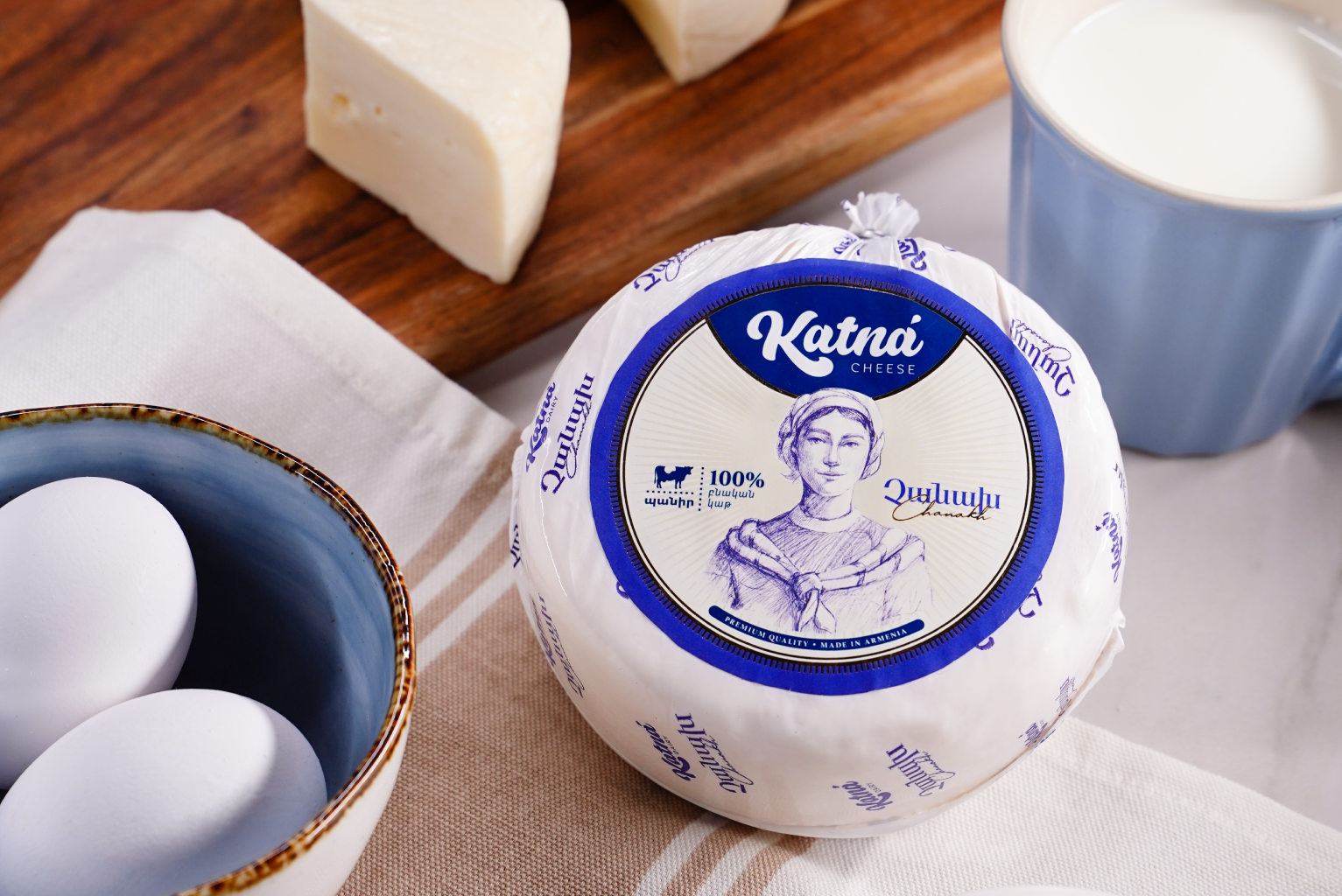
Katna


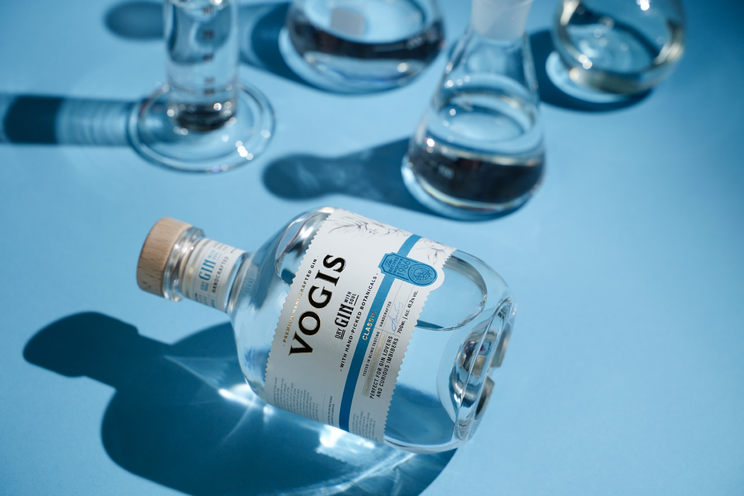
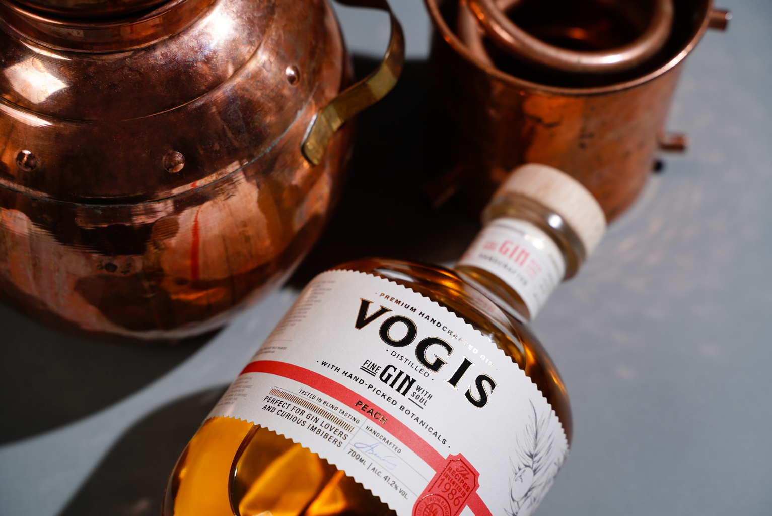
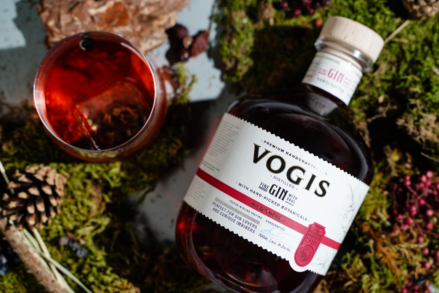
Vogis
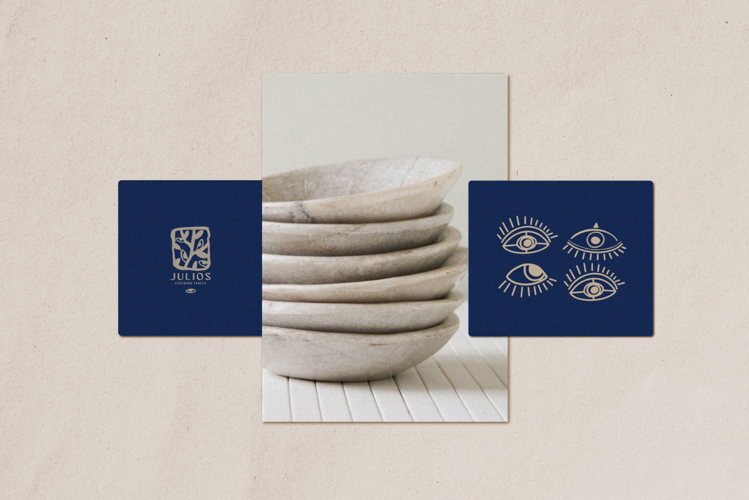
Julios
Julius Restaurant is a new and mysterious place near the city center, that brings Mykonos life to Yerevan. The restaurant is the embodiment of Greek and Mediterranean culture and creates a pleasant atmosphere with a mysterious mood.


Recent Comments