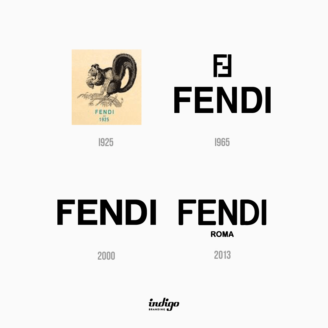
In 1925, the first Fendi logo was introduced. It looked a little unusual and was different from the logos of other fashion houses. The logo featured a squirrel sitting on a walnut tree branch.
This photo was not chosen by chance. It was essential for the Fendi family ․ A painting of a squirrel was once presented to Eduardo Fendi to his wife Adele, who he said was as busy as a squirrel.
Beneath the image was a logo with capital letters and a strict sans-serif typeface. At the bottom was the inscription “1925” as a slogan. Both parts of the lettering were finished in a turquoise blue that looked very sophisticated on the brand’s light tan paper.
This version of the logo persisted until 1965 and only changed after Karl Lagerfeld joined Fendi
Lagerfeld drew the famous “FF” sign on a piece of paper in just a few seconds. “FF” – Fendi was written at the bottom of the text, again in capital letters, sans serif, long and straight.
Lagerfeld drew the famous “FF” sign on a piece of paper in just a few seconds. And the black logo beneath it was written in all caps in solid and straight sans-serif, matching the height of its letters.
In 2000, the “FF” mark was removed from the official version of the logo. It was used only for printing on leather and fabric.
The logo consisted only of the word Fendi.
The font remains the same, but the spacing between these letters has been increased. Thus, the logo has become lighter and airier.
In 2013, the logo was redesigned. As a result, the font on the logo became more rounded and lost its former clarity. The font used is very similar to the Basic Commercial Soft Rounded Pro Bold font. Although the letters are now round, the logo remains strong and elegant while maintaining its classic shape.
“ROMA” is written at the bottom of the logo, the font is the same, but the size is smaller.
ROMA is a tribute to the brand’s homeland and a source of inspiration.

Recent Comments